
having unique shapes, optical weight, and distinctiveness
given by colour or texture. The form of letters can evoke
appropriate reactions from viewers. You just need to know
how to do it.

SIGN PAINTING
Exceptional places require exceptional presentation, especially in the case of luxury brands. The appearance of a storefront is a crucial element, often determining whether a potential customer will take notice and step inside. It provides an opportunity to win an Oscar in the category of “special effects” or be like end credits – colourless and monotonous.
The unique character of boutique spaces can be achieved through sign painting – the artisanal craft of hand-painting signs. Though forgotten by many, it is experiencing a revival.
A personalised storefront enhances prestige, adds soul, and imbues the space with elegance and exclusivity. These impressions cannot be replicated using commercial stickers or traditional templates. They are particularly appreciated by owners of renowned boutiques and service establishments, for whom timeless quality matters most.

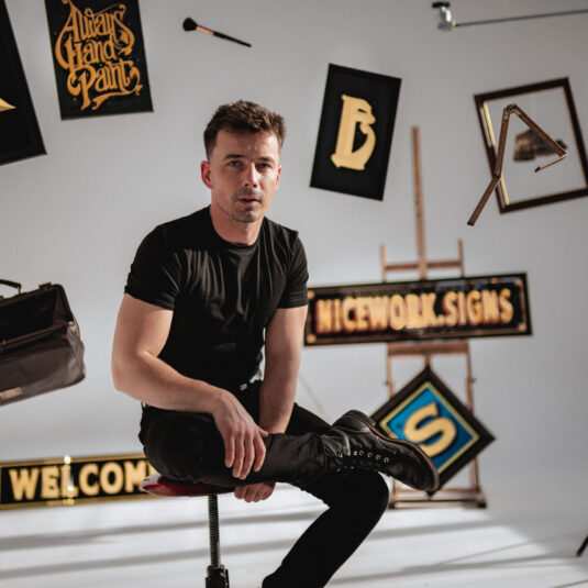
ABOUT ME
Functional art and artistic painting are my passion, which I have been developing for over two decades. My adventure with sign painting began with the inspiration of the signs I admired while staying in Bristol, where I lived for a few years. I was drawn to the way the lettering integrates with the surrounding architecture. Upon returning to Poland, I realised that what I had seen then was a separate field of art that I wanted to develop further.
At first, my knowledge was based solely on information found on the internet, but I knew it wasn’t enough. I attended my first training sessions in London, which took place as part of the London Design Festival. There, under the guidance of renowned and esteemed sign painters from the UK – Ash and Sara Bishop from Brilliant Signs, as well as from the USA – Mike Meyer from Better Letters, I expanded my workshop.
For several years, my mission has been to improve public spaces so that building facades, storefronts, and signs stand out with the appropriate form and impeccable aesthetics.
SERVICES
The service is performed using gold, silver, or copper. I also use enamel from the American brand 1 Shot. The karat amount of gold depends on the effects, which are determined based on the individual preferences of the client. 24k gold will have more yellow tones, while 12k gold is white but more noble.
The basic technique of gilding glass is gilding to a gloss, giving a mirror effect. By using a special, transparent glue that somewhat “wrinkles” the gold leaf, we achieve a matte effect. These techniques, which relate to gilding glass, are called reversible. Additionally, we also distinguish gilding on opaque, aversive surfaces such as wood, metal, or concrete. In this case, by using appropriate mordant primers, it is possible to achieve a more or less glossy gold effect.
In addition to visual values, the quality aspect is also important. Inscriptions made with this method are more durable and withstand atmospheric conditions. In case of the need for intervention, they are easy to remove and at the same time, do not leave marks on the surface.

PROJECTS


CUSTOMER REVIEWS

"Kacper Ankiel is an artist who impresses with professionalism, virtuosity, and extraordinary talent that cannot be simply achieved. His works are executed with incredible precision, using the highest quality materials, within the agreed upon timeframe. I recommend cooperation with Kacper to anyone who expects outstanding results."
"Beautiful designs and excellent execution using traditional materials, tools, and methods make Mr. Kacper's signs enchanting and evoke the atmosphere of elegant, pre-war Warsaw. We are delighted that the Szczotek i Pędzli workshop, which will soon celebrate its hundredth anniversary, has received a new, magnificent sign reminiscent of that pre-war era."
"It is with pleasure that we provide a reference for Mr. Kacper Ankiel, with whom we had the opportunity to collaborate on the project of opening Belvedere Café, located at Krakowskie Przedmieście 4, part of Belvedere – Cafe Łazienki Królewskie Sp. z o.o. Mr. Kacper was responsible for creating the signs and gilded logos, which have become an integral part of our establishment's aesthetic. The entire collaboration process went smoothly—Mr. Kacper demonstrated complete professionalism, creativity, and commitment at every stage of the project. All the elements he delivered are characterized by exceptional craftsmanship and an aesthetic that perfectly fits the prestigious character of our café. The final result not only met our expectations but even exceeded them—the signs and logos created by Mr. Kacper are a true adornment of our space. We wholeheartedly recommend Mr. Kacper Ankiel's services to anyone seeking exceptional quality and artistry in the creation of signs and logos. Working with him was a genuine pleasure, and his work undoubtedly contributes to enhancing the prestige of any investment undertaken."
"Kacper is definitely an artist worth recommending! He can turn a client's vision into true art, and he approaches his work with incredible diligence. We have already completed several projects together, and more are ahead of us!"
"Kacper touched our storefront and turned it into gold, literally. We are very pleased with its current appearance, which is a tribute to true craftsmanship, or rather artistry. It was definitely one of the best investments. It's a great pleasure to work with such a talented and professional individual. We recommend him to everyone!"